
Nokia Lumia 720 Was a Midrange Masterpiece (Video)
If there is one thing the vast majority of midrange smartphones these days suffer from, it’s probably originality. The first aspect that takes a big hit compared to their high-end siblings is design, in all of its aspects from visually to their choice of materials. Well, here is an example of a beautiful midranger that can even put its flagship big brother at notice; the Nokia Lumia 720, and here is its story:
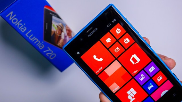
I never personally owned the 720, although I recommended it to many people close to me who ended up getting it so I have a rough idea about how nice it was. But unboxing my own unit, using it for a few days and showing it to the people I know made my admiration for such a design grow. The Lumia 720’s design is a work of art. It’s sleek, elegant, unique, cohesive, nicely built, and sits perfectly in the hand. Looking at it reminds me of what Nokia’s ex-SVP of design Marko Ahtisaari talked about when describing the design philosophy on the Lumia 920; It looks like something that might exist in nature, with its easy on the eyes yet complex to apply design.
As a student of design, I can’t help but feel sad a little that since Fabula, no phone design language has resonated with me so deeply, and with how smartphones have evolved to be all-screen with the design taking a back seat intentionally, none ever might again. I would love to be proven wrong though, and now that we have reached a point where raw specs have become less relevant than ever (As Nothing’s Carl Pei also implied in a recent interview), I would love to see brands put more attention into design again. I’m hoping that the “Love It” aspect of Nokia Mobile’s marketing will remind the brand not to lose such a focus, as we’ve seen recently on the forgettable design language of the G11/G21. There is still hope for X.


